If you’ve ever landed on a website and instantly thought “this doesn’t feel right” — you’re not alone.
And chances are, your potential clients are doing the same with yours.
Having a professional website isn’t about being flashy. It’s about feeling trustworthy, credible, and clear — in seconds. Below are a few of the key things we look for (and fix) when someone comes to us with a site that “just isn’t working.”
✍️ 1. Clear Messaging
Within three seconds, someone landing on your site should know:
- What you do
- Who you do it for
- Why they should stick around
Most websites waffle, bury the point, or try to sound clever. You don’t need clever. You need clear.
❌ “Welcome to our website”
✅ “Websites That Win Work – Built in 2–4 Weeks”
Say it straight. Make it obvious. If they have to scroll to understand what you do, you’ve already lost them.
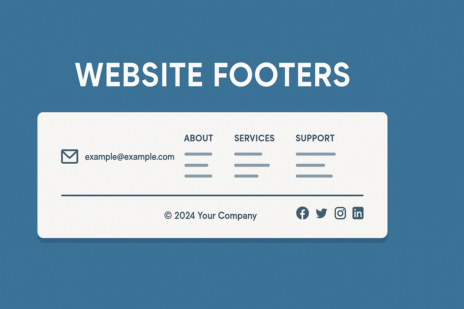
🎯 2. Clean Layout That Guides Action
It’s not about how much content you can cram in. It’s about how easy it is to take in.
Too many sites throw everything on the page — but all it does is confuse people. Good design gives space to breathe, keeps the eye moving, and makes the next step obvious.
One page = one goal. Don’t fight for attention. Guide it.
📱 3. Mobile-First Design
We think about everything for mobile first, because that’s where your clients are.
A “responsive” site that kind of works on phones isn’t enough anymore. If your buttons are tiny, text is cramped, or navigation is a guessing game — it’s costing you enquiries.
Your site should feel effortless on a phone. That’s what people expect now. We build it that way from the start.
⚡️ 4. Speed That Builds Trust
If your website takes 5 seconds to load, it doesn’t matter how good it looks. People won’t wait.
Speed is one of the quickest trust signals there is. A fast site says:
“We’ve got our act together.”
We aim for under 2 seconds load time on every build. If your current one’s dragging, it’s worth sorting.
To test your website loading time, check out gtmetrix.com.
Don’t beat yourself up if you’re not getting 100% performance, just aim for the highest score possible, somewhere in the green. GTmetrix, provides a grading system. Aim for a grade of A to B.
💬 5. Real Testimonials (Not Just Vague Praise)
We say this a lot, and we’ll say it again. People don’t buy from websites, they buy from people.
So show them some. Drop in a quick quote. Add a name. Better still, show a real result.
“We used to get 2–3 leads a month. Now we’re getting at least one a day.”
– Lee, S&L Carpets (Real Testimonial)
Even one decent testimonial with a name carries more weight than a paragraph of “high quality service” chat.
🧠 6. Consistency
Fonts. Buttons. Colours. Spacing. It all adds up.
When your site looks pieced together or patched over, people assume your business is too.
That doesn’t mean it needs to be trendy, just tight. Pick a style. Stick to it. Make everything line up.
It should feel like one cohesive experience, not 5 different pages glued together.
🔁 7. One Clear CTA
You don’t need five different buttons.
One clear action is enough:
- Book a call
- Get a quote
- View our work
If someone wants more, they’ll scroll. But don’t make them choose between five next steps. Keep it simple, and repeat it a couple of times. People will take the hint.
Conclusion – Websites that win work
A professional website isn’t about design trends or bells and whistles.
It’s about being clear, consistent, useful and fast. It should make people think:
“These guys know what they’re doing.”
That’s what we build. Websites that win work.